Style the chat widget
Match the chat to your site: theme and colours, corner style, button position and size, language and greeting — with a live preview as you go.
The widget is the chat button in the corner of your site plus the chat window that opens when someone clicks it. You can make it match your brand in a couple of minutes, no developer needed. Everything saves automatically and goes live on your site straight away — there's no Save button.
Step 1. Open the Widget tab
Go to Settings (the gear in the left rail) and open the Widget tab. The options are on the left; the Live preview on the right updates the moment you change something.
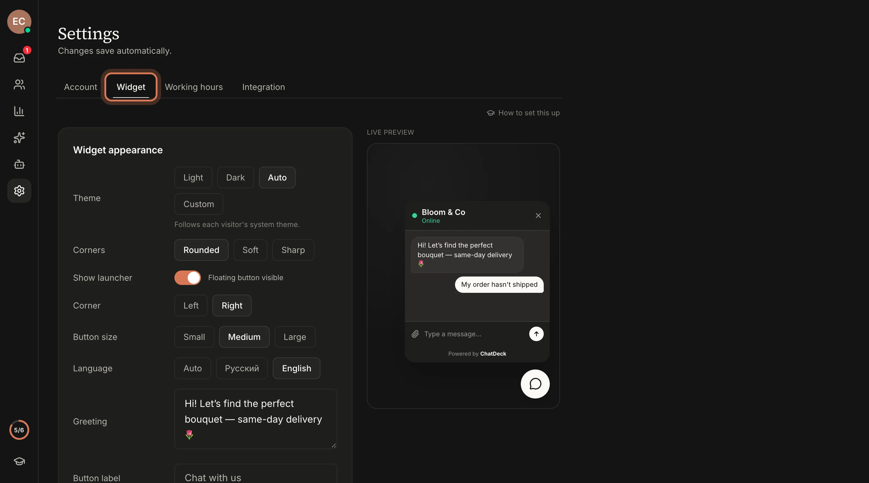
"Saving…" and then "Saved" appear in the top-right corner — that means the change is already applied.
Step 2. Pick a theme and corner style
Under Theme, choose one of:
- Light or Dark — built-in colours, nothing else to set.
- Auto — follows each visitor's system theme: light by day, dark at night if that's how their phone or computer is set up.
- Custom — a Colours block appears with six fields: Brand colour, Text on brand colour, Panel background, Text colour, Launcher colour and Launcher icon. Click a swatch to pick a colour, or paste a code like
#d97757.
Then under Corners, choose Rounded, Soft or Sharp — this shapes the window, the message bubbles and the button.
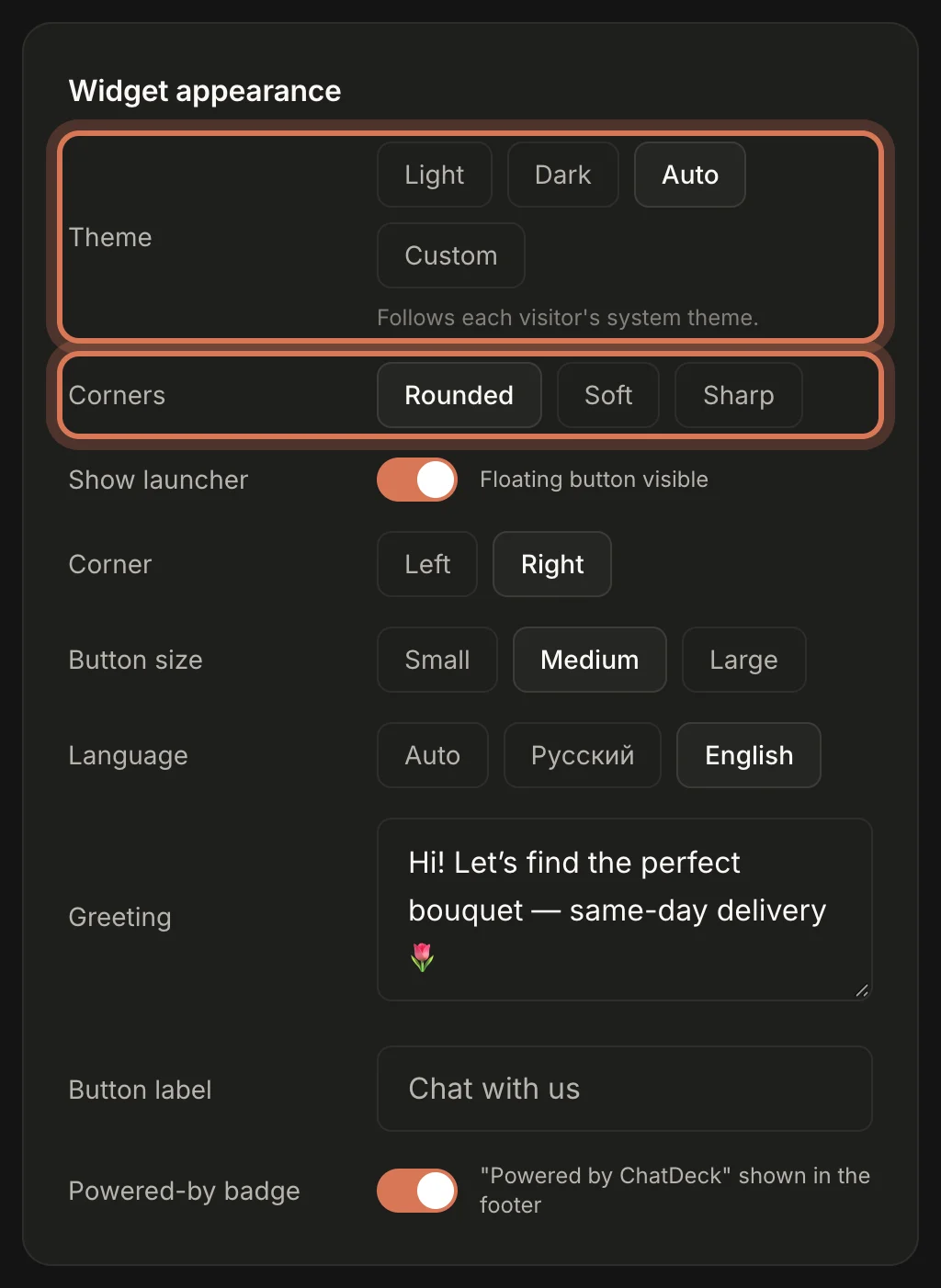
Take your brand colour straight from your site — usually the colour of your buttons or logo. The widget works out borders and muted text from the panel background for you.
Step 3. Set up the chat button
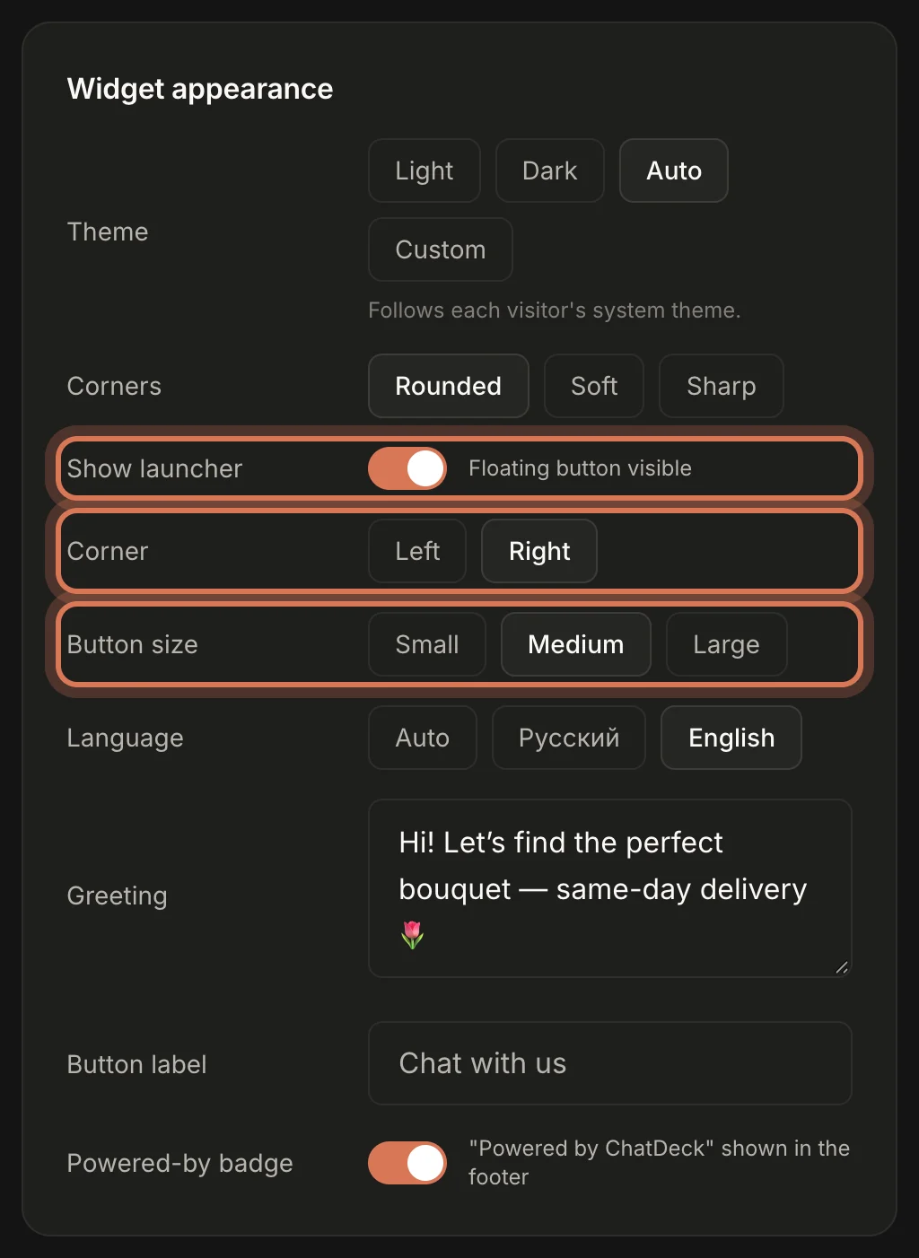
- Show launcher — keep it on to show the round chat button in the corner of your site. Turn it off and the button disappears; the chat then opens only from your own button on the site (a developer job — see "For developers" on the Integration tab).
- Corner — Left or Right. Pick the side where the button won't cover anything important, like a basket or a "back to top" button.
- Button size — Small, Medium or Large.
Step 4. Language, greeting, button label and badge
- Language — the language of the widget's own text (the message box, buttons, rating card). Auto follows the visitor's browser; Русский or English always uses that one.
- Greeting — the first message a visitor sees when they open the chat. For example: "Hi! Let's find the perfect bouquet — same-day delivery 🌷". Leave it empty to use the standard greeting in the visitor's language.
- Button label — the text that pops up when someone hovers over the chat button, such as "Chat with us".
- Powered-by badge — the small "Powered by ChatDeck" line at the bottom of the chat window. You can turn it off on any plan.
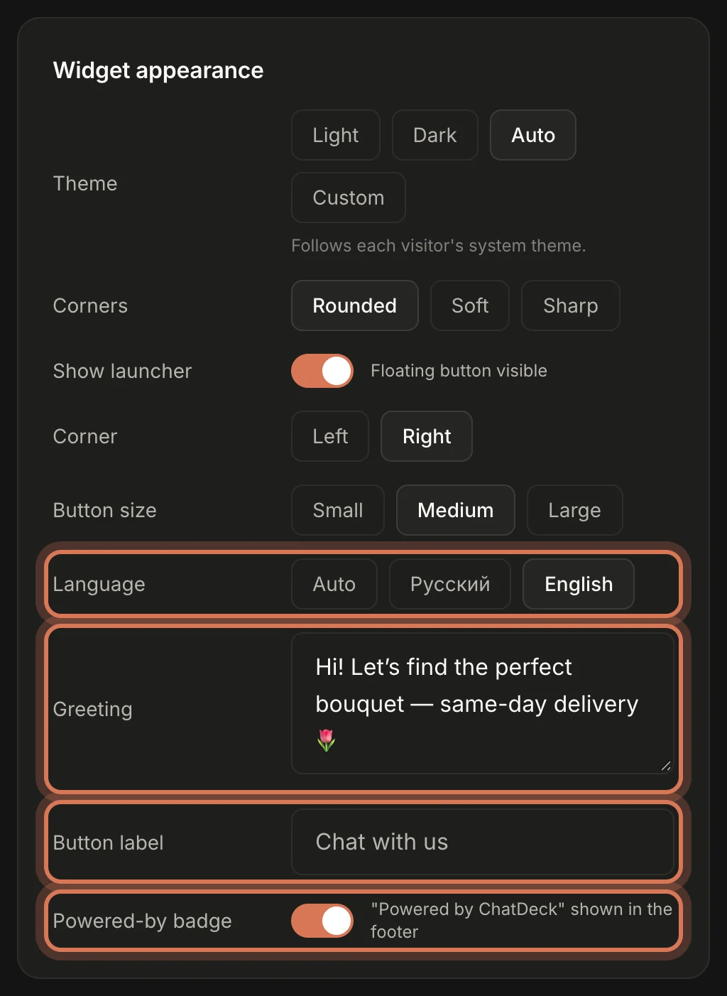
A good greeting says how you can help, not just "Hello". People are more likely to write when they know what they can ask about.
Step 5. Check the live preview
The Live preview on the right of the tab shows how the chat window will look: theme, corners, greeting, button position and size, and the badge. Try different options and compare until you're happy.
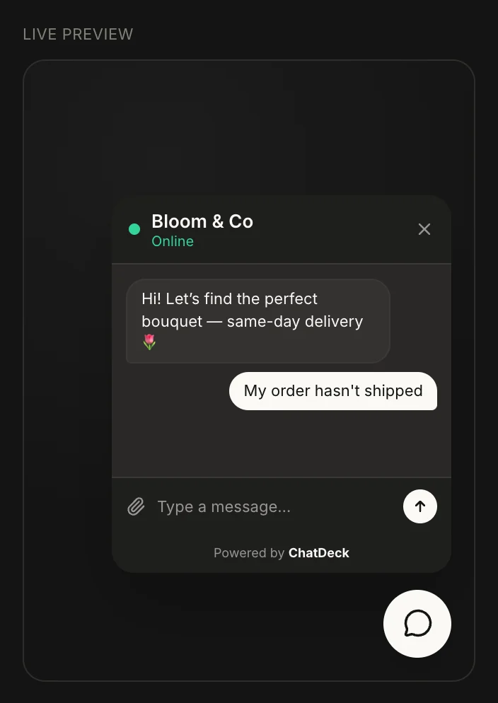
With the Auto theme, the preview uses whichever theme your own computer is set to right now.
Step 6. Check it on your site
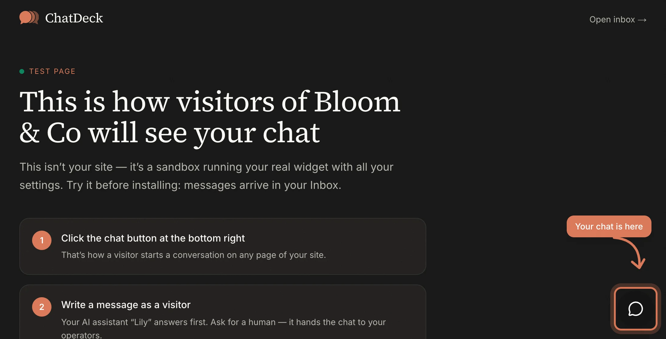
Open your site: the chat button sits in the corner you chose. Click it and the chat window opens with your greeting. New settings apply right away — just reload the page.
FAQ
My changes don't show on the site
Hard-reload the page (Ctrl+F5 or Cmd+Shift+R). If there's no chat on the site at all, install the code first.
Can different pages have a different look?
The settings apply to the whole site. A developer can change the look on specific pages with chatdeck('config', { … }) — there are examples under "For developers" on the Integration tab.
Next: set your working hours so visitors know when your team will reply.
Still have questions? Write to support@gptunnel.ru — we’ll help you get set up.